
“Vision Statements” and “Mission Statements” seem to be everywhere.
Most companies have some “visioneering” statement. “Vision” and “Mission” are common for small- to medium-sized businesses. Larger businesses (with larger marketing budgets) seem to use “Guiding Principles,” “Leadership Principles,” “Purpose,” “Core,” “Core Values,” “Manifesto,” and an assortment of other titles. You will see these statements on plaques, banners, marketing communications, employee recruitment packets, and websites.
But most of these “visioneering” statements are useless.
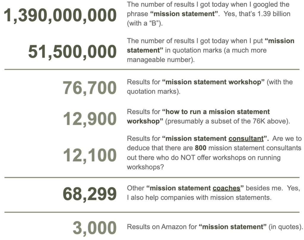
Searching for “study on whether managers think mission statements are worthwhile” (but without the quotes) yields 106 million results. The top three results were from Forbes, Harvard Business Review, and researchgate.net. This third result was a link to a 2016 study that included this sentence in its abstract:
“The study results indicate a small positive relation between mission statements and measures of financial and organizational performance.”
https://www.researchgate.net/publication/235278094_Looking_for_the_value_of_mission_statements_A_meta-analysis_of_20_years_of_research
An article on LinkedIn that showed up on the first page of this search cites two main problems with such statements:
- how distantly-removed the people are who developed the statements from the people supposedly living them (“Usually invented by people I don’t know at some time in the past…”).
- Such statements are typically conceptual and vague.
Indeed, I frequently use the phrase “vague, meaningless platitudes” when critiquing mission and vision statements.
Most top managers believe “visioneering” statements are a good thing; they provide direction and purpose, describe a company’s values, help allocate scarce resources, and communicate with stakeholders. However, most of these statements fail to capture anyone’s attention, much less drive desired behavior and outcomes.
Is there a way to create statements that uniquely stand out, resonate with stakeholders, and accurately reflect what the company is all about?
A well-designed visual image can produce a much more powerful and memorable response than a mere mission statement.
Is the phrase “vision statement” an oxymoron? After all, most vision statements are chock full of words, cloudy words at that.
Since our brains are wired to make sense of and remember visual input rapidly, diagrams, charts, drawings, pictures, and various other ways can help people understand complex information.
Humans are sight (vision) dominant. 30% – 40% of our cerebral cortex is devoted to vision compared to 8% for touch or just 3% for hearing.
I want to introduce three wildly disparate ideas from the business and design world and then illustrate how to blend these ideas to result in a single ILLUSTRATION that uniquely captures your business’s essence:
Your Proven Process – Gino Wickman, in his book Traction, suggests creating a visual representation of the way your company works.
Value Delivery System – Michael Lanning’s Delivering Profitable Value describes the structure of fully thought-out ideas that forms the basis of a solid business proposition. I have previously written about this topic here and here.
A Simple Graphic Design Idea – Along with a few essential design principles, Nancy Duarte’s Slide:ology recommends including a simple icon for a person to represent your target customer. This icon can serve as the focal point of your value delivery system.
I want to be clear…
I am suggesting that companies, instead of developing vague, wordy mission statements, quite literally illustrate (draw) their mission statements.
I’m not talking about using flowery, visually descriptive words like the author of a novel. I’m talking about pencil to paper, oils to canvas, Adobe Illustrator to computer screen DRAWING your mission statement. Here’s why.
Numerous researchers have long extolled the virtues of “visual learning.” One study easily found online by Tea Romih, PhD in Nanotoxicology, lists these facts to emphasize why using visual aids in scientific communication is essential. I extend her arguments to ALL communication, not just science-related communication.
I am developing a webinar and workshop series to help business owners and leadership teams toss their vague, meaningless platitudes. I’ll help replace them with a tangible value delivery system (written in plain language employees already use). Then, we will illustrate it in a way that captures attention.
Your company can then use this picture in speaking with your various stakeholders (investors, employees, customers). The beauty is that your illustration will be grounded in reality because it describes what your company actually does, not some vague ideal. Better still, it suggests a rational, well-thought-out organizational structure. This, in turn, promotes natural alignment throughout the company; the people doing the work and adding the value out in the field, in the call centers, and on the shop floor become instantly aligned with the purpose of the company. This kind of alignment is unheard of in corporate America today.
For an in-depth discussion of these ideas, along with an example, please click here to download a free E-Book.